PACKAGING DESIGNS
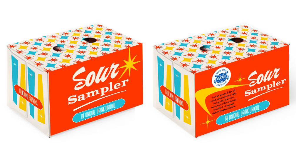
sour sampler
SAMPLE PACK
The goal was to create a mix-sample pack that would stand out on the shelf while still feeling cohesive across multiple beers. The solution leaned into Blue Owl Brewing’s bright colors and retro aesthetic, using bold patterns and mid-century modern star flourishes to create a vibrant, eye-catching package.
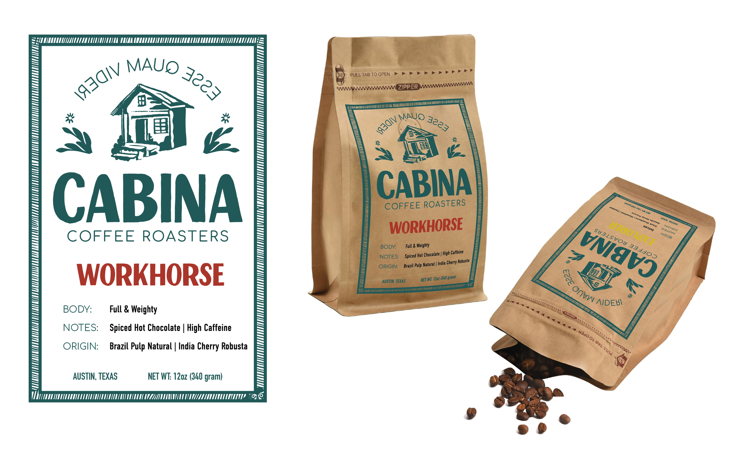
CABINA
COFFEE ROASTERS
PACKAGING
Cabina Coffee Roasters wanted a natural, mystical brand with a handmade feel. We created a stamp-style packaging system with hidden storytelling elements woven into the design.
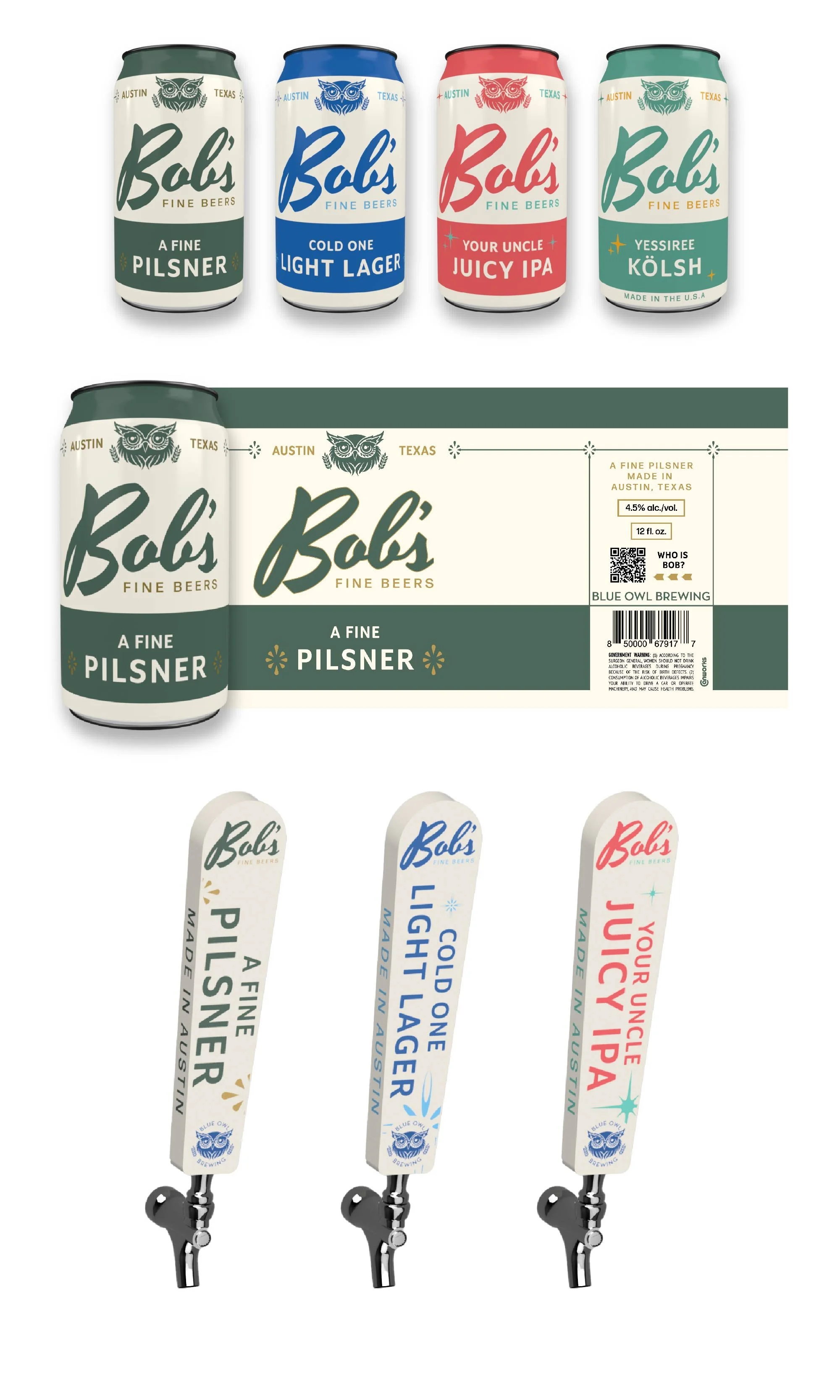
BOB’S FINE BEERS
PACKAGING + TAPHANDLES: VARIOUS STYLES
Blue Owl Brewing, known for its sour beers, expanded into clean brews and needed packaging that felt fresh while nodding to its retro roots. We created a cohesive system with a consistent off-white base, changing only the accent color and a unique “blemish” mark for each style. The result is a clean, 1960s-inspired look that balances brand consistency with visual variety and bridges Blue Owl’s playful identity with a more classic, streamlined aesthetic.
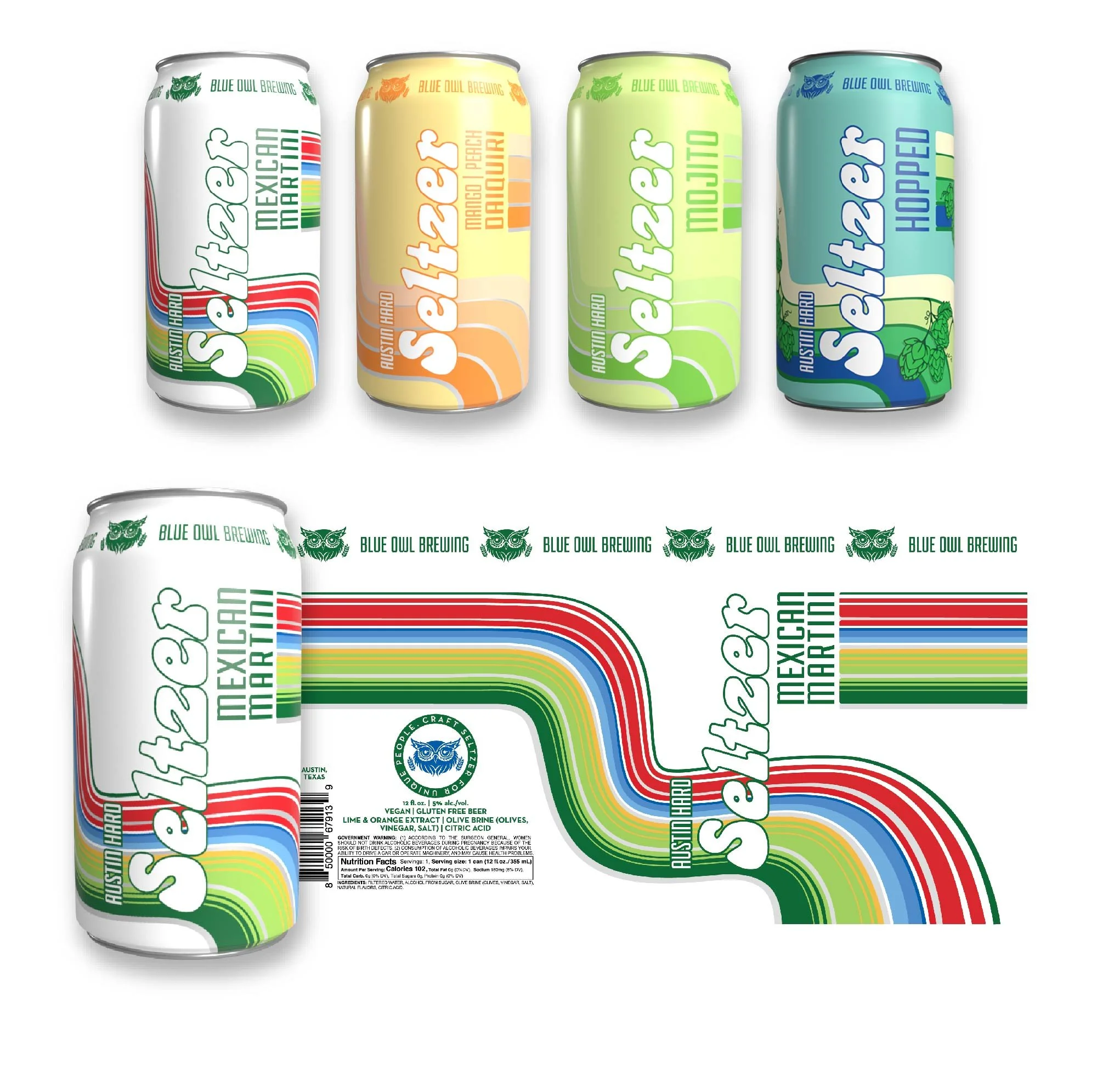
AUSTIN HARD SELTZERS
PACKAGING: HARD SELTZERS - VARIOUS FLAVORS
This new line of hard seltzers was designed to stand out during the seltzer boom with a fun, retro-inspired look. Bright, bold colors reflect each flavor, while a consistent layout ties the collection together. A custom, handmade font for “Seltzer” adds a playful, personal touch that enhances shelf appeal.
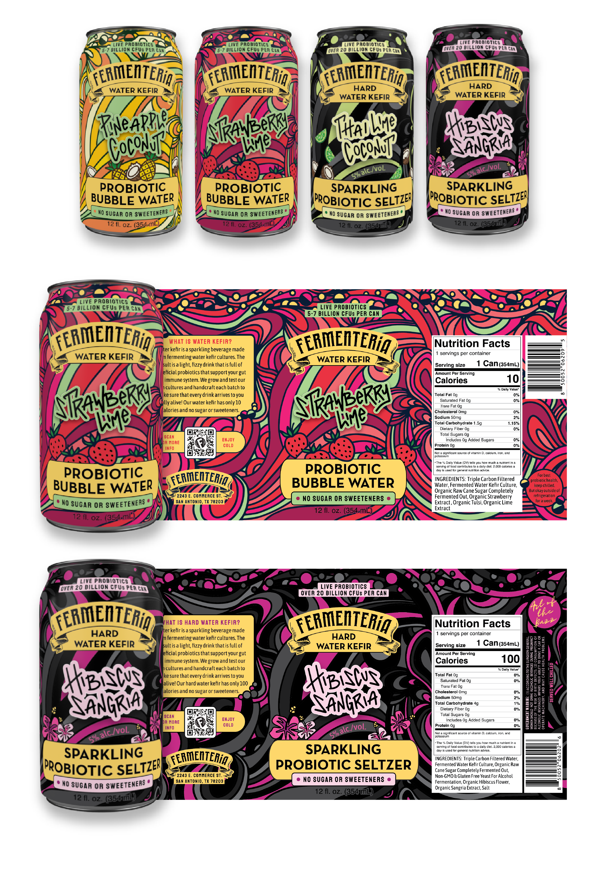
FERMENTERIA
PACKAGING:
HARD WATER KEFIR +
NON-ALCOHOLIC WATER KEFIR
- VARIOUS FLAVORS
Fermenteria launched a bold new kefir line in a category that’s still emerging, aiming to stand out with vibrant, eye-catching packaging that reflects their unconventional, free-spirited vibe. The design uses a shared layout across all products to build brand recognition, while clear visual cues differentiate alcoholic from non-alcoholic options.
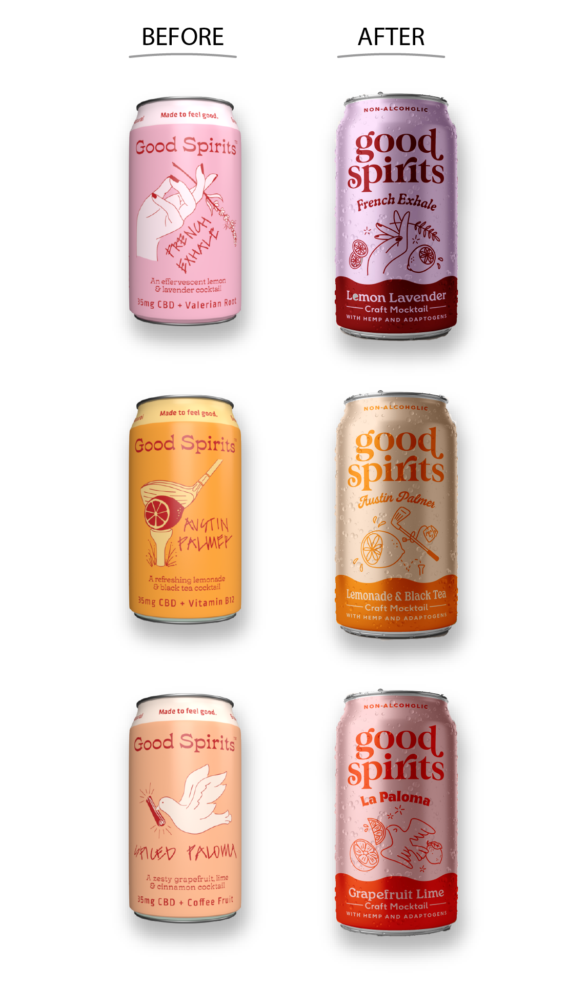
GOOD SPIRITS
PACKAGING:
CBD NA DRINK - VARIOUS FLAVORS
Good Spirits brought me on for both the original packaging design and the recent rebrand, where I created hand-drawn illustrations and guided the transition to a refreshed look. The goal was to maintain their playful, flavor focused look while bringing a more minimalist style that felt fresh and aligned with their brand values.
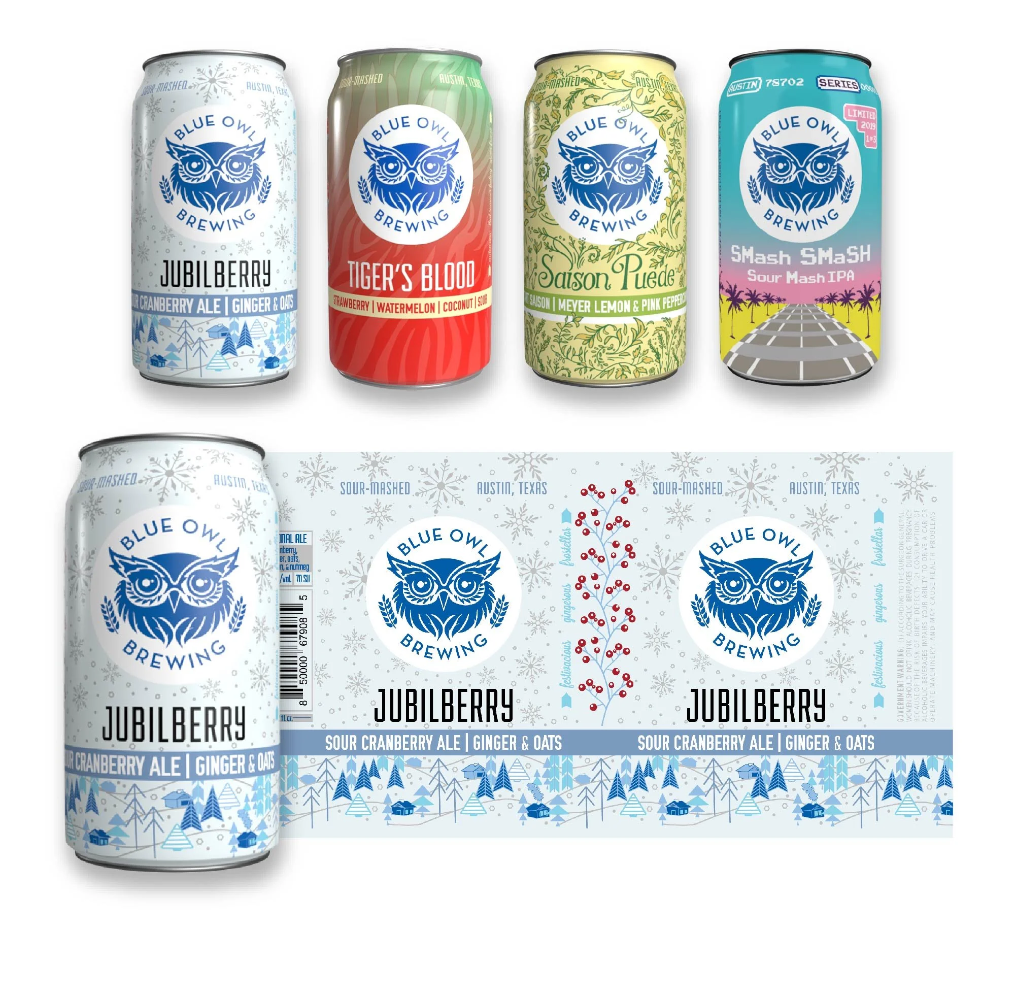
BLUE OWL BREWING
PACKAGING:
SEASONAL SOURS - VARIOUS FLAVORS
Blue Owl Brewing’s seasonal sours embrace a more playful and expressive design than their core lineup. Each can features a bold, custom pattern that reflects the flavor or season, following a consistent layout while allowing room for creativity and shelf impact.
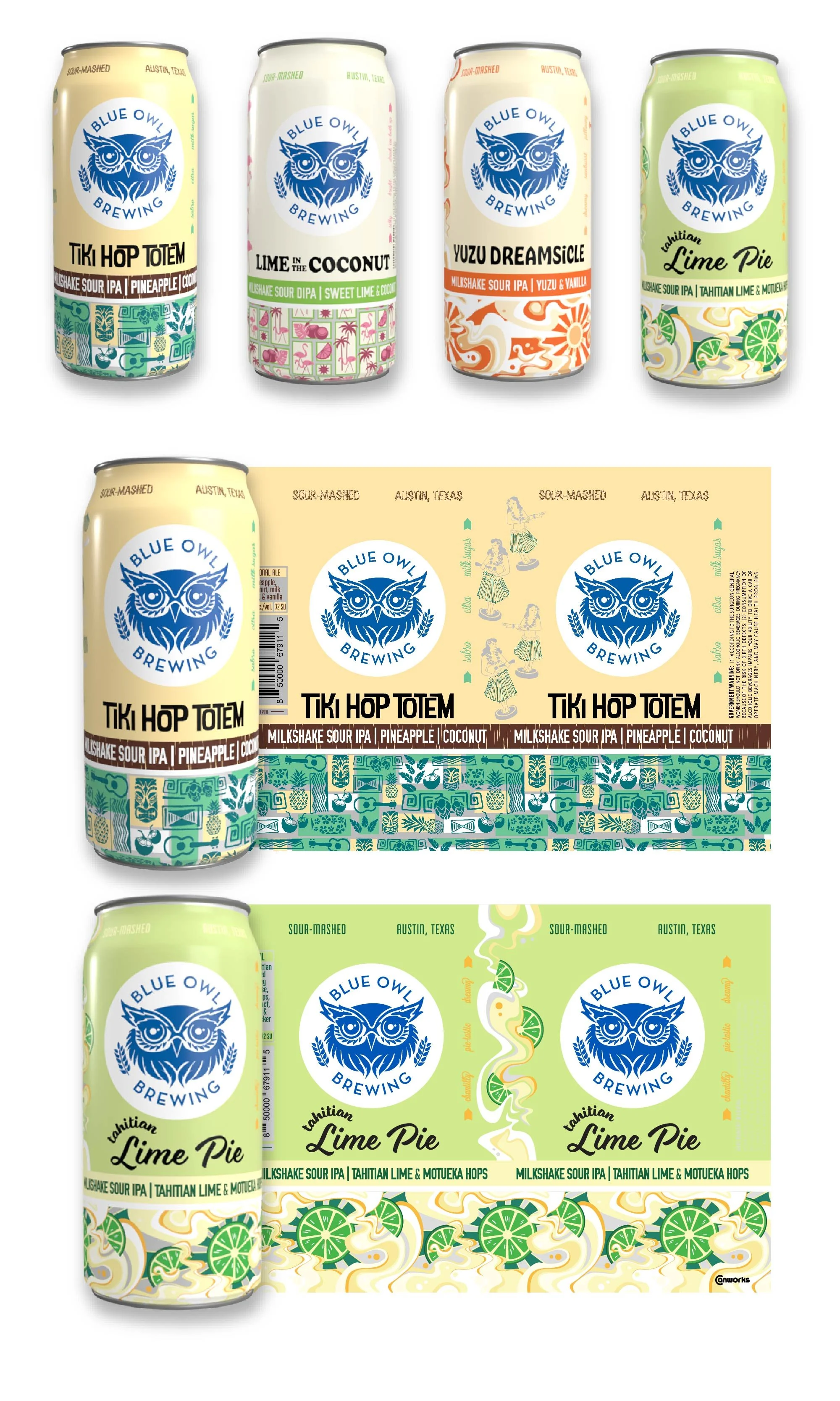
BLUE OWL BREWING
PACKAGING:
16OZ SEASONAL SOURS - VARIOUS FLAVORS
Blue Owl Brewing’s seasonal Milkshake IPA tallboys feature a bright, refreshing color palette with a consistent layout. The bottom third of each can showcases a playful, rotating pattern—unique to each flavor but unified in style—to create a fun, eye-catching look that highlights the individuality of each release.